The Public Land Survey System is a way of diving land. They are mostly used to divide public domain lands in the United States.
Sunday, December 5, 2010
"Isopach"
This type of contour map usually shows information about the underground levels of the geological strata.
An isopach map usually illustrates common areas of thickness of a given area.
"Thematic Map"
These maps portray physical, social, political, cultural, economic, sociological, agricultural, or any other aspects of a city, state, region, or nation.
"Unclassed"
Unclassed choropleth maps use gradient shading without having to specifically categorize data. Usually the darker the shading the higher the number or percentage is.
"Standardized Choropleth"
Standardized Choropleth
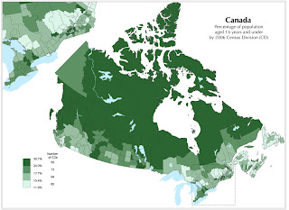
Maps are standardized so that information can be compared without bias. The map above standardizes the percentage of individuals aged 14 and under in Canada in 2006.
Maps are standardized so that information can be compared without bias. The map above standardizes the percentage of individuals aged 14 and under in Canada in 2006.
"Unstandardized Choropleth Map"
Unstandardized choropleth maps fail to report relativity of data. These maps can be misleading as the fail to reveal any control. There is no set variable in which we can measure the magnitude of the data.
"Nominal Area Choropleth"
Nominal Choropleth
Nominal choropleth maps display nominal data. In the map above as the number per capita of collegiate basketball players increase, the color gets darker.
"Line Graph"
Line graphs are normally used to compare two different types of data. Usually the vertical scale(dependent variable) is affected by the horizontal scale (independent variable). Line graphs can be altered and can mislead if numerical scales are not represented correctly. The map above is a multi line graph that displays the population of five states over a period of 100 years. Florida had the most exponential growth from 1970 to 2000.
"Interactive Map"
Interactive maps allow users to proactively navigate a map illustration. Users can zoom in and out over a large or small area. As you can see in the map above the smaller picture is a zoomed in view of the larger map.
"LIDAR Map"
LIDAR Mapping
Light Detection and Ranging (LIDAR) is a remote sensing system used to collect topographic data.
Light Detection and Ranging (LIDAR) is a remote sensing system used to collect topographic data.
LIDAR uses laser pulses,
measuring the time delay between the transmission of the laser pulse
and the detection of the reflected signal, to determine the range of an object. This type of mapping has been very beneficial to meteorologist and was the basis of the Global Positioning System.
"Sonar Map"
A Sonar map is most often used to display the ocean floor and are very useful in motion planning. Sonar maps use sound waves to map out the contours of the bottom of the ocean.
"Site Map"
A site map can be a document used for web planning tool for a web design or a web page that shows available websites that can be used. The information is usually designed in a hierarchical fashion.
"Isoline Map"
An Isoline map is a continuous map with lines or colors conveying some common point or value. Isoline maps are most often used in thematic mapping. Isoline maps are 2D representations of 3D models. The most often display weather or elevation conditions.
"Lorenz Curve"
The Lorenz curve exploits the degree of inequality that exist within a distribution of two variables
"Pie Chart"
Pie Chart
A Pie chart illustrates proportions that make up a whole. The sizes of the pieces covey the percentage of a specific piece of data. The angle of a section also tells you something about that particular piece of data. The map above breaks down the monetary expenditure of government funds.
A Pie chart illustrates proportions that make up a whole. The sizes of the pieces covey the percentage of a specific piece of data. The angle of a section also tells you something about that particular piece of data. The map above breaks down the monetary expenditure of government funds.
"Mental Map"
A mental map is a personal perception of one's world around them. The map above displays all the ways that Google contributes to an individual's life. Mental maps can be found in the field of Sociology. Mental maps are a way of organizing ideas in our mind.
"Index Value Plot"
Index Value Plot
An index value plot compares relative data to indexed data. In the graph above the different colored lines show the shape of the frequency lines. 1985-1995 had the greatest increase in stock price numbers.
An index value plot compares relative data to indexed data. In the graph above the different colored lines show the shape of the frequency lines. 1985-1995 had the greatest increase in stock price numbers.
"Scatterplot"
Scatterplot
A scatterplot uses dots to show the relationship between two variables. Normally, the closer the dots are together means there is a greater correlation between the two. The map above shows a negative correlation. The higher the elevation is the lower the temperature gets.
A scatterplot uses dots to show the relationship between two variables. Normally, the closer the dots are together means there is a greater correlation between the two. The map above shows a negative correlation. The higher the elevation is the lower the temperature gets.
"Population Profile"
"Population Profile"
A population profile is a chart showing the number of people as a fuction of age. The chart above shows the number of people with and without aids, male and femalw. Based on the data, men and women ages 15-25 have the greatest number of people, compared to other age groups, with aids.
A population profile is a chart showing the number of people as a fuction of age. The chart above shows the number of people with and without aids, male and femalw. Based on the data, men and women ages 15-25 have the greatest number of people, compared to other age groups, with aids.
"Climograph"
Climograph
A Climograph is a geographical representation of climatic parameters, such as monthly average temperature and precipitation. The map above shows the temperature and precipitation level in Brazil. As you can see the summer months have the least amount of rain.
A Climograph is a geographical representation of climatic parameters, such as monthly average temperature and precipitation. The map above shows the temperature and precipitation level in Brazil. As you can see the summer months have the least amount of rain.
"Triangular Plot"
A triangular plot also called a ternary plot, displays information with a constant sum. It is most often used in geology to show the relative compositions of soils and rocks, but it can be applied to any system with three variables.
"Parallel Coordinate Graph"
Parallel Coordinate Graph
A parallel coordinate graph displays the relationship among variables. The data can be considered multidimensional.
A parallel coordinate graph displays the relationship among variables. The data can be considered multidimensional.
"Box Plot"
Box Plot
A box plot, sometimes referred to as box and whisker plot, is used to show five different number summaries at one time; the smallest observation or minimum, lower quartile, the median, upper quartile, and largest observation the maximum. A boxplot may also indicate if a data set has outliers or extremties. In the box plot above the minimum is about 30, while the maximum is about 125.
A box plot, sometimes referred to as box and whisker plot, is used to show five different number summaries at one time; the smallest observation or minimum, lower quartile, the median, upper quartile, and largest observation the maximum. A boxplot may also indicate if a data set has outliers or extremties. In the box plot above the minimum is about 30, while the maximum is about 125.
"Steam and Leaf Plot"
The digit in the greatest place value of the data values are the stems. The digits in the greatest place values are the leaves. Stem and leaf plots are often used in mathematics. The picture above shows the number of infant mortalities in Western Africa. The greatest number of mortalities is 151 deaths according to this data.
"Cadastral"
Cadastral
Cadastral maps are an essential part of the land management infrastructure. These maps are generally expensive and take a long time to make. Cadastral maps are also used to show land ownership and property.
Cadastral maps are an essential part of the land management infrastructure. These maps are generally expensive and take a long time to make. Cadastral maps are also used to show land ownership and property.
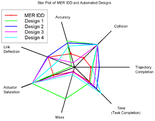
"Star Plot"
A star plot is a graphical data analysis technique for examining the relative behavior of all variables in a data set. Variables are represented by "spokes." The length of each spoke reveals the magnitude of the variable of the subset.
"Black and White Aerial"
Black and White
Aerial photos are photos taken from birds eye views. There are two types; oblique and vertical shots. An oblique shot is one that is taken from a low point relative to the object, while a vertical is taken from a relatively high point directly overhead. The map above is a vertical aerial shot since the camera is pointing straight down.
Aerial photos are photos taken from birds eye views. There are two types; oblique and vertical shots. An oblique shot is one that is taken from a low point relative to the object, while a vertical is taken from a relatively high point directly overhead. The map above is a vertical aerial shot since the camera is pointing straight down.
"Correlation"
We identify correlation with the relationship between two variables. There are positive correlations and negative correlations. A positive correlation happens when both variables move in the same direction. For example the amount of time spent studying and test scores are positively correlated.
"Windrose"
Windrose
Windrose maps show wind frequency and direction. These maps can also be interchanged as what we refer to as a compass rose.
Windrose maps show wind frequency and direction. These maps can also be interchanged as what we refer to as a compass rose.
Saturday, December 4, 2010
"HISTOGRAM"
A histogram gives a visual representation of a data set . Histograms allow us to visually recognize distinctions of numerical information. The rectangles are tabular frequencies that can either be touching or separated. Histograms are useful when trying to recognizer the mode in a data set. Based on the information displayed i the graph we can clearly see that the majority of employees working for this business make between $21,000-$4290 per year.
"Isobar"
Isobars are used to show places on a map of equal or constant pressure pressure. The map above shows a storm heading across the country. If you look closely, you can see that the storm is heading West based on the notches on the isobar lines.
Statistical Map
A statistical map shows the variation of a particular factor over a given time period. Statistical maps can be displayed by using dot plots, choroplelth maps, and also proportional symbol maps. In the example above the ration of how likely a specific area is to be hit by a hurricane is shown in red. As you notice areas in South Florida are collectively more likely to be target areas as they are closer to the Gulf.
Subscribe to:
Comments (Atom)


